Curent layout:
Revised layout:
And now, on to the dream finishings!!
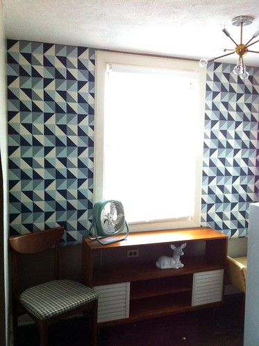
I think all of these choices would all go along nicely with our newest addition wallpaper at the top of the stairs
As well as the rest of the bedroom/sitting area:
I kept everything that matters classic by using white subway tiles and penny rounds for the floor, but instead of white penny rounds, I went with black-- it's my dream world here, I can do this. I also would pick a classic claw foot tub and place it under our window in the upstairs bath, with a frosted window of course, so no one sees in! This is different from what the diagram above shows, but I was dreaming!! In reality, we would probably do an extra large tiled shower stall with glass doors.
Next, I picked one of the wallpapers that I haven't been able to get out of my head, Dandelion Clocks by Sanderson.
Followed by a black and white striped runner such as the Draper Rug by Dwell.
For the sink and other furniture, I would rely on flea market finds or architectural salvage yards for just the right thing...something in the vein of a vintage pharmacy or dental cabinet similar to what we have in our downstairs bath would be great.
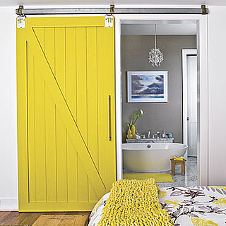
And lastly, I love the sliding barn style door on a track made modern with a bright yellow! A smaller version of this would work perfect with our planned renovation to the upstairs bath/closet area.
We'll see how many of these elements I can actually work in... on a budget... and with the approval of the Mr.
If you get a chance, go over to OlioBoard and vote for my design! Thanks!!
If you get a chance, go over to OlioBoard and vote for my design! Thanks!!


No comments:
Post a Comment